
The “Bridge to Betterment” PRC’s Logo Made of 62,000 Mirrors, By PRC Employee Seth Abrahamson
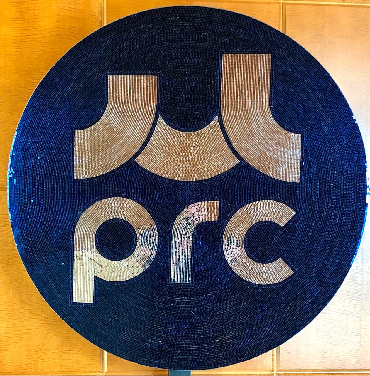
If you attended PRC’s Mighty Real Gala earlier this month, you probably saw a shimmery logo in place of the traditional step and repeat wall, and maybe even took a picture or two next to it. This was my gift to PRC and to everyone here who makes it their mission to help others improve their lives. I had recently finished a similar piece for myself and after sharing pictures with my colleagues, was asked to create this vibrant piece of art.
It’s likely that my love for making art out of mirrors stems from my childhood memories of watching my mom make stained glass. I would help her cut and grind each piece shaping the fragile, yet sturdy medium into a vibrant backlit puzzle. Some projects were composed of thousands of intricate shapes of all colors and took months of precision to complete. I assume this was where I learned the patience required for my iteration of transforming glass into art.
Live music is another big passion in my life and at the center of almost every performance space is a disco ball: beautiful in any light but shine a focused beam on it, and it returns a spectrum of rays creating a mesmerizing sense of motion. My partner, Ron, asked me to make us both disco ball hard hats for a local street fair a few years back, and that’s where my passion for mirrored art began. The hats became quite popular and from there my imagination took off. I began cutting the already tiny mirrors into much smaller pieces, using a variety of colors, to cover just about any object with intricate and detailed designs. When my colleagues asked me to create this logo out of mirrors, I jumped at the opportunity.
The logo is titled “Bridge to Betterment” and represents PRC’s values: warm and welcoming, bold and inspiring, knowledgeable and optimistic. To me, the logo represents a bridge on the road to self-improvement, split into the ups and downs one faces when embarking on this type of journey. To be a part of something with such a powerful message makes me incredibly honored, and I’m excited to have been given the opportunity to share it with our community.
Four feet in diameter, the logo contains more than 62,000 individual blue and silver glass mirrors, each measuring five millimeters squared or smaller. The average thumbnail is roughly the size of six to nine mirror tiles. The base is made of a 3/8 inch thick piece of plywood to be sturdy yet light, and the mirrors make up two-thirds of the total weight of the finished piece. For the most part, I’m able to place the mirrors close enough together to give the appearance of smooth clean curves, but there are also thousands of smaller tiles that were cut to fill in the gaps. If you walk through my home while I’m working on a project of this size, you’re likely to leave with a piece of mirror stuck to your shoes or socks. I know I’m constantly finding them in the laundry.
The mirrors come in pre-scored and broken sheets and have a web-like adhesive backing. I cut the sheets into strips, which I then twist and bend to stretch the adhesive backing to allow for curves. Many of the mirrors are placed one at a time, especially towards the center. The use of additional glue is needed to permanently secure each tile to the base or object. To cut the mirrors into smaller pieces, I either score them with a glass cutter and use jewelry pliers or my fingers to break them, or I use small cutting pliers and cut them similar to if I were using scissors. Amazingly I have only experienced a few very minor cuts.
I began with the three spans of the bridge and the letters, each of which took roughly three hours to complete. I then moved to the outermost circular and worked inward to maintain the resemblance of the grooves on a vinyl record. In the beginning, each circular row took roughly 30 minutes to complete, and I became keenly aware of my four-week deadline with each row. I happily devoted my nights and weekends to get as much done as possible, and in a way, it was a sort of Zen for me. I would frequently become entranced and lose track of time.
In the end, the project took 97 hours of deeply focused work, 11 square feet of blue mirror tiles, and 5 square feet of silver tiles to complete. I then attached the logo to a floor-mounted flat-screen TV stand, and it was unveiled on Friday, November 5th, during PRC’s Mighty Real Gala, at the San Francisco Four Seasons Hotel. Camera flashes could be seen all night as guests posed for pictures next to it, and others felt compelled to rub their fingers across the smooth surface as they marveled at the level of detail. The logo now shimmers in the natural light filling the common space in PRC’s offices for everyone to enjoy. If you join PRC at one of our future events, there’s a strong chance you’ll get to take a picture next to it too. To say that I’m proud of the result is an understatement, and I hope the logo will be enjoyed for years to come.

Related Articles
 Preventing Homelessness Before It Starts: Why Timely Support Matters More Than EverREAD MORE >
In the Bay Area—and especially in San Francisco—housing stability is increasingly fragile. Sky-high housing costs, rising medical exp[…]
 We’re excited to welcome Chaney Ojinnaka to PRC’s Board of Directors.READ MORE >
“I joined PRC’s Board because of my deep interest in behavioral health in underserved populations, and the opportunity to support a mission-[…]
 We’re proud to welcome Shairah Willis to PRC’s Board of Directors.READ MORE >
From the very beginning, Shairah felt a strong connection to PRC’s work—not just because of the mission itself, but because of how that miss[…]